Healthcare Website Design
Healthcare-Focused UX
Web Design
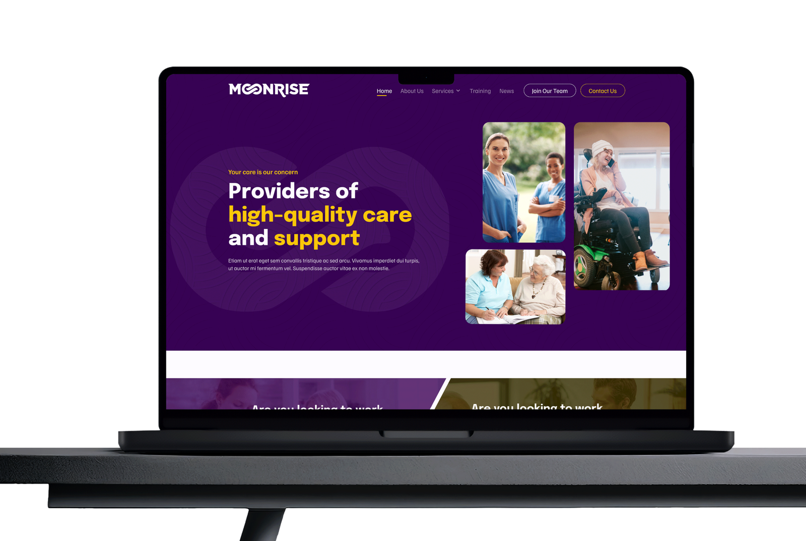
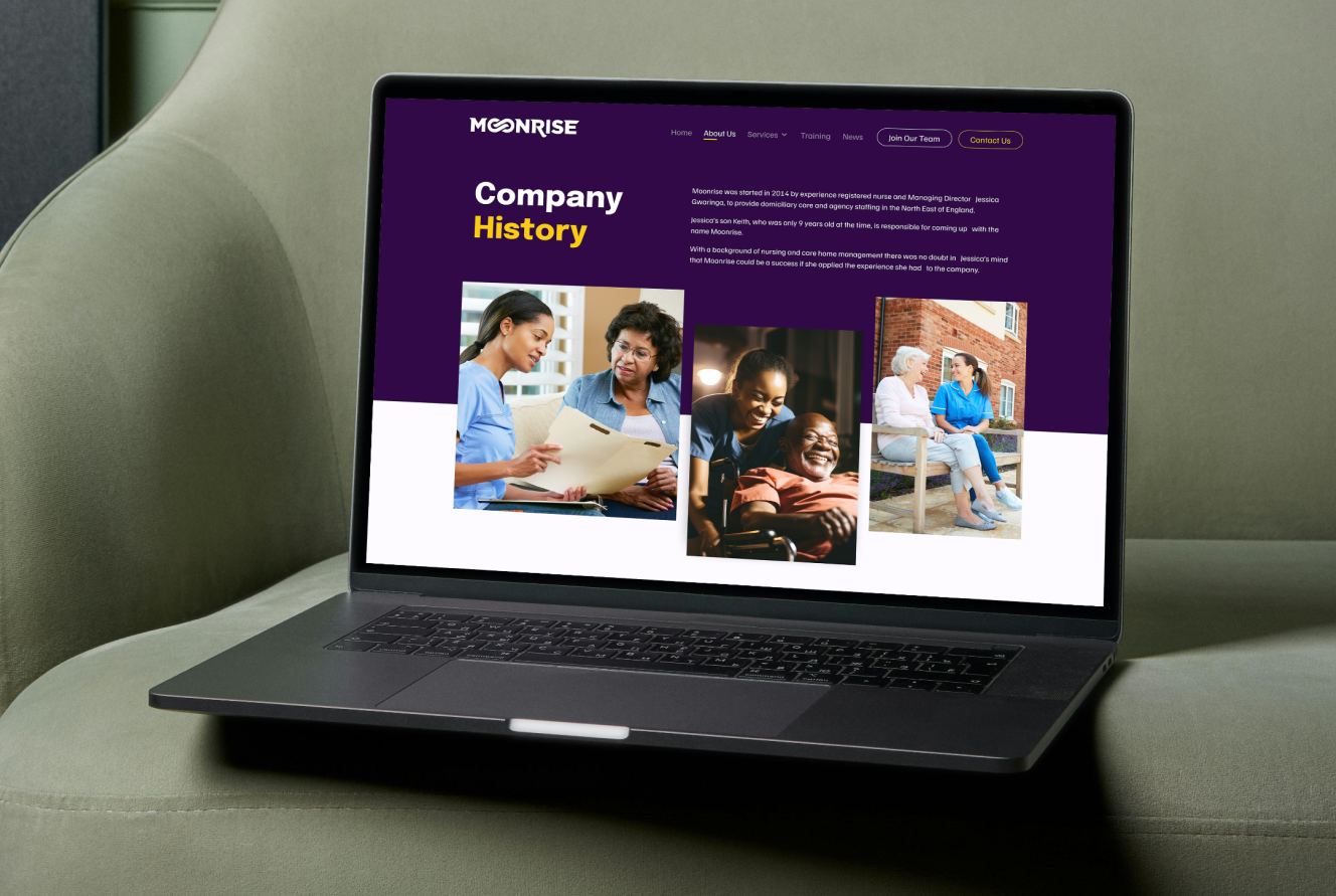
This website was designed to help Moonrise — a trusted healthcare and support service provider — connect individuals seeking reliable care with professionals pursuing fulfilling careers in the healthcare sector.
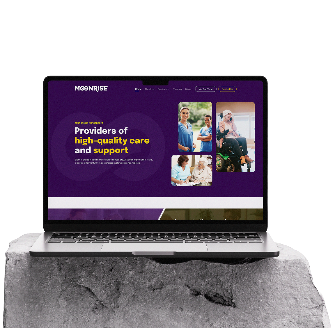
The Moonrise website serves two key audiences — individuals seeking reliable care and professionals seeking fulfilling career opportunities in healthcare. The design focuses on empathy, professionalism, and clarity, ensuring users can easily find information or take action.
The design process followed a structured and iterative user-centered approach:
Conducted qualitative and quantitative research to understand user behavior, pain points, and expectations. Analyzed competitor websites to identify gaps and best practices within the healthcare sector.
Quality Research
Constative Research
Competitive Analysis
Synthesized findings into user personas, key goals, and information architecture. Established a clear problem statement and project scope for focused design direction.
User Stories
User Persona
Empathy Mapping
Problem Statement
Developed wireframes and high-fidelity UI screens with a focus on usability, accessibility, and brand consistency. Created interactive prototypes for feedback and iteration.
Style Guide
Component
Low Fidgety Wireframe
high Fidgety Wireframe
Tested the prototype with real users to identify usability issues and gather feedback. Refined the design based on insights to ensure a seamless and intuitive user experience.
Feedbacks
Conclusion
Usability Testing
Defined two primary personas — a family member seeking care services and a healthcare professional seeking work. Each persona guided design decisions to ensure the site met real user needs.

"Managing my health feels overwhelming with my busy schedule. I wish there was an easy way to track appointments, medications, and health records all in one place."
Healthcare Assistant
29
Birmingham, UK
Explore open positions and apply directly through the website.
Learn about company culture, benefits, and training opportunities.
Access application forms easily on mobile.
Understand the hiring process and expected timelines.
Join an organization with a strong reputation for care quality.
Build a long-term career in a supportive team environment.
Finds many care job portals outdated or hard to navigate.
Job listings are often unclear or missing key details.
Long and complicated online application processes.
Difficulty determining if the company values its employees.
Lack of transparent contact or HR information.
Needs reassurance of job security and fair pay.
The visual identity of ALLOTX was designed to balance professional trust with approachable clarity.
Your conversions under attack?
The UI/UX Army is on standby. Get a free UX rescue report — we’ll pinpoint the problem zones and send reinforcements.